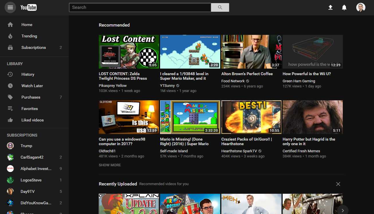
Behold! YouTube’s new desktop design. The background is one solid color, and there’s a subtle shadow under the main search bar.
Here’s the old design, if you’re wondering what changed. The gray background is gone, along with many dividing lines. The “Home/Trending/subscriptions” tabs at the top left.
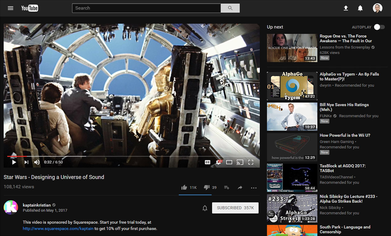
The biggest addition is a dark mode! Nighttime video watching will never be the same.
There is now a big menu attached to the profile button. You can turn on the dark theme here.
Here’s the dark mode.
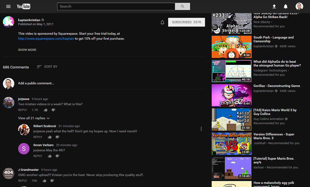
Here’s the new comment section.
Dark comments.
YouTube has a new look, with the desktop site getting a “Material Design” revamp today. The design has slowly been leaking out in A/B testing, but today the company is making it official.
YouTube says the new plan aims for a “simple, consistent, and beautiful” look. Most of YouTube’s box-heavy card design has been erased, instead of going with a pure white background, the usual grid of thumbnails, and white space. YouTube makes use of Material Design’s trademark shadowing, with a pinned search bar at the top of the screen. It’s not a drastic change until you turn on the new “dark mode,” which replaces all the white UI with something easier on the eyes. The dark mode switch lives in the new profile menu, which you can access by clicking on your profile picture in the top right.
Material Design was introduced three years ago in Android 5.0 and is meant to be a unifying design style for all of Google. Seeing it finally come to YouTube is nice, but it is still missing from flagship products like Gmail and Google Calendar, which were both last redesigned in 2011.
The design isn’t automatically rolling out to everyone yet. Users can opt-in to a “preview” of the design over at youtube.com/new, and it’s easy to revert to the old design if you don’t like it. YouTube is soliciting feedback on the new design before a wider rollout; it suggests you leave feedback via the link on the account menu.
YouTube’s new interface is built on Google’s Polymer framework, a JavaScript library for creating Web components with a focus on building Material Design-style apps on the Web. With the Polymer base up and running, YouTube says it will have “quicker feature development from here on out.” It cites the dark theme as the first of these Polymer-enabled features and ends with saying, “This is only the beginning—you can look forward to more powerful new features coming soon!”



![[Top 9] Chat Forums on Deep Web | Deep Web Chat Rooms | Enter At Your own Risk Top 9 Chat Forums on Deep Web, The Lolita City, onion deep web, dark web lolita, lolita city,](https://www.gadgetgyani.com/wp-content/uploads/2018/03/deep-web-CHAT-FORUMS.jpg)
